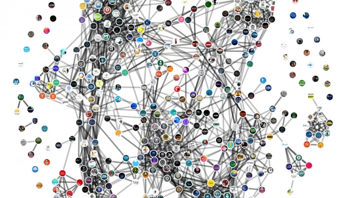
Earlier this month, I took a list of the top shows in Apple Podcasts, and drew a map showing how those shows were clustered into “neighbourhoods.” I thought it was pretty cool.
Today, I want to share how I’ve been using the same technique to understand podcast audiences at an even deeper level, and identify niches within niches — many of which were surprising and new to me.
First things first
Before we start, it’s important to remember the basics:
- Apple Podcasts has a list of podcast categories like
Comedy,Technology, andSwimming. Individual podcasters choose which category they want their show to appear in. - Each category in Apple Podcasts has its own top shows chart.
- Many shows in the Apple Podcasts directory include a “Listeners Also Subscribed To” section, which lists related shows based on common audiences.
Knowing this, we can choose any category in Apple Podcasts, look at its top shows chart, and identify neighbourhoods of shows with related audiences, based on their “Listeners Also Subscribed To” data.
With me so far?
Let’s dig in.
A stroll through the Technology podcast neighbourhood
Here at Pacific Content, we work with many tech companies, including Dell, Red Hat, Mozilla, and McAfee, and many of our clients’ shows are listed in Apple’s Technologycategory.
Technology is crowded.
It contains more than 55,000 different shows, and doesn’t include any subcategories for specific niches. All tech shows get lumped together into one big bucket. That makes it an excellent candidate for network analysis, which can help us understand the tech podcast landscape in much greater detail.
Here’s a map of neighbourhoods within the Technology category (click for an interactive version):
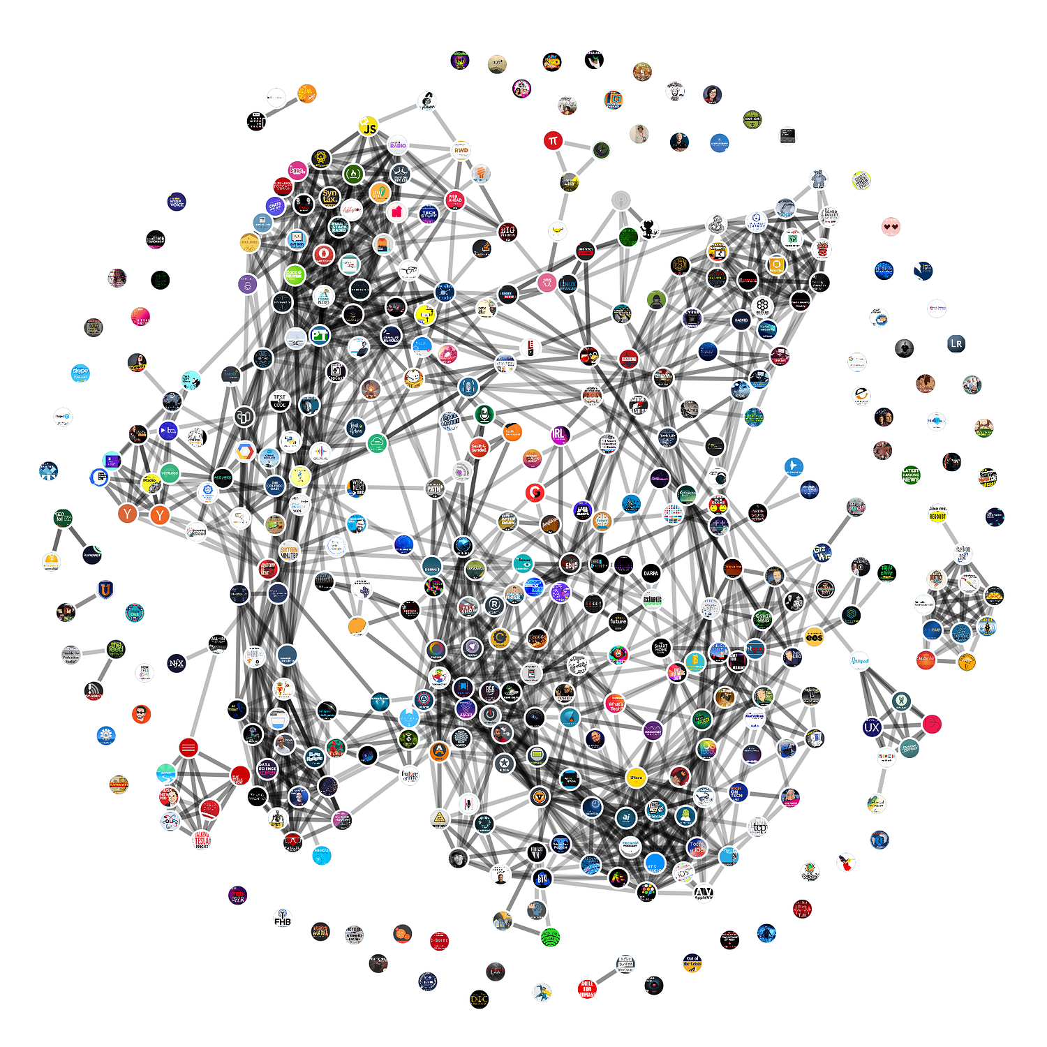
Looking at the graph, we can see several neighbourhoods of shows with common audiences. Let’s explore at a few.
Hackers and cybersecurity

One of the most prominent neighbourhoods includes shows about cybersecurity. It includes podcasts for practitioners like Smashing Security and Naked Security Podcast, as well as broader consumer-facing shows like Hackable?, Darknet Diaries, and Malicious Life.
Artificial intelligence and machine learning
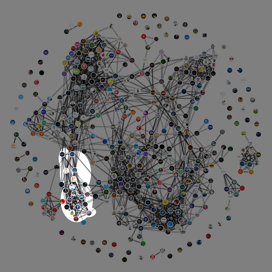
Artifical intelligence and machine learning are hot, and it’s no surprise to see a dedicated cluster of shows focused on these topics, including AI Today, Talking Machines, Machine Learning Guide, and Practical AI: Machine Learning & Data Science.
UX and UI

User experience and user interface are interesting because they straddle the worlds of technology and design. A number of UX and UI-focused podcasts decided to list their shows in Apple’s Technology category, and many of them are linked by common audiences in a neighbourhood that includes Design Details, UXpod - User Experience Podcast, and Awkward Silences.
Ham radio
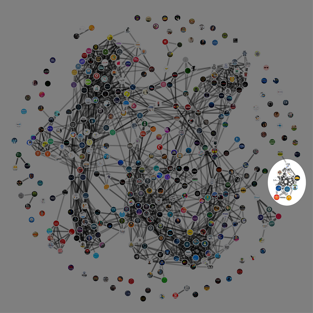
I was surprised by this one, and it’s a good example of how network analysis helped me identify podcast communities I never would have otherwise thought about.
It seems there’s a tightly-knit neighbourhood of shows about Ham radio, including Ham Radio 360, Ham Radio Crash Course, and 100 Watts and a Wire.
Tesla enthusiasts

Speaking of podcast communities built around specific technologies, we also see a cluster of shows for Tesla enthusiasts, including Elon Musk Pod, Tesla Daily: Tesla News & Analysis, TALKING TESLA, and The Tesla Show — A Tesla Podcast.
Cool. But what can I use this for?
Smart podcasters understand their audience, then build shows designed to serve that audience.
If your show lives inside a big, broad category like Technology, this type of network graph can help you understand the niches within your category. For example, I recently shared a neighbourhood map of the Fictioncategory, and the audio drama community immediately started to identify patterns.
If you have a paid media budget, network analysis can help you identify shows to buys ads from. If you don’t have a paid budget, it can help you identify shows to partner, cross-promote, and collaborate with.
If you’re developing a brand new show, a neighbourhood map can help you recognize audience appetites, and identify gaps that could represent programming opportunities.
And if, like Pacific Content, you help brands make original podcasts, a network graph can be a helpful gut check. For example, I was delighted to see three of our clients’ shows appear in entirely different neighbourhoods. Hackable? appears in the cybersecurity neighbourhood. Command Line Heroes appears alongside other developer-focused shows. And IRL: Online Life is Real Life is connected to a number of different neighbourhoods, which makes sense for a broad-appeal show about the health of the internet.
Think about your show. Ask yourself, “Which neighbourhood are we in? Is it the neighbourhood we want to live in? If not, how do we move to a new neighbourhood?”
Which of Apple’s podcast categories are you most interested in? Tweet at @PacificContent — I’m taking requests for neighbourhood graphs!
Sign up for the Pacific Content Newsletter: audio strategy, analysis, and insight in your inbox. Once a week.
