How to make amazing podcast artwork
It may seem counterintuitive, but podcast listeners often use their eyes first, and ears second.
That’s why podcast artwork is so important.
Great podcast artwork is simple, legible, pictographic, and scalable. It needs to work gracefully in many different contexts. And it needs to stand out from the crowd. A tall order, indeed.
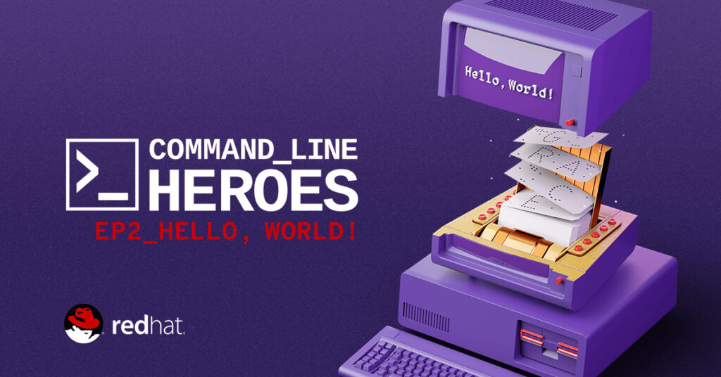
Recently, I talked to Nick Burns and Laura Walters. They’re responsible for the visual identity of Command Line Heroes, an original podcast from Red Hat, the leading open source software company.
Nick and Laura have created some of the most ambitious and impressive podcast artwork I’ve ever seen. What’s more, they shepherded the show’s graphics through a major refresh, making sure the visual elements of the podcast have kept pace with the tone and content of the audio.
Dan Misener: What’s the job of a piece of podcast artwork?
Nick Burns: The job is first to convey the type of content you’re going to experience, whether that’s as broad as humorous vs. technical. Or it’s as specific as the topic itself. The visuals need to communicate the tone and the content in a really quick glance.
Laura Walters: Personally, I notice when podcast art isn’t great. And I notice when it is great. As a listener of podcasts, I really enjoy when the graphics are good, and it encourages me to trust the publisher of that content and then keep exploring more of what they produce.
DM: What makes podcast artwork great?
LW: For me, great podcast artwork is simple. It doesn’t say everything. It’s readable at a small scale.
The cleanliness of a design will get me to click and find out more. I know that if the publisher took the time to know that good design is worth doing… then they probably have good content.
DM: Podcast artwork is displayed in so many different contexts. How do you design artwork that works well in podcast directories, on social, on the web, etc.?
NB: I think that was one of the biggest challenges. When you see podcast artwork on whatever platform you get your podcasts from, it’s just in a sea of the exact same size of other graphics.
Then, when you’re seeing it on social media, it’s in a sea of other messages. So there’s never this big airy moment that you can make a statement. It’s just these small little pockets that have to fight against what’s around it.
And so, something that made sense was when there’s the consistency of a look that you start recognizing no matter where you’re seeing it. Having that look was our step into how do we tackle this, because there’s really just too many places this can exist to try to customize for every single experience… in which case you just end of with a system that feels a little bit disjointed or fractured.
DM: How did the Command Line Heroes artwork change from season one to season two?
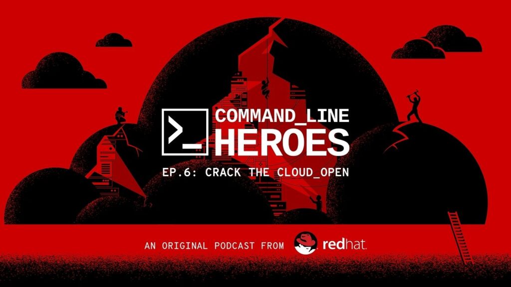
NB: Season one was dark, serious, mysterious, moody. And then season two was more approachable, optimistic, energetic. Color was a big driver for us to get from season one to season two. That shift made a big difference.
In terms of how we did it: we had a really great team of writers, and designers, and motion graphics designers from Red Hat’s Open Studio all getting into a room together once a week. Early on we set the direction we wanted to go for the season as a whole. Then we just took one episode at a time and started concepting these different experiences for every episode, from thumbnail sketches to final art.
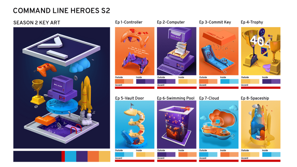
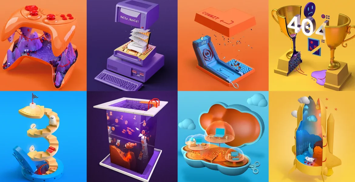
DM: Season one’s artwork was two-dimensional. For season two, it went 3D. Tell me about that.
LW: There was this whole idea of an app opening up and an object inside to represent each episode.
The needs of the deliverables also helped drive the decision [to go 3D]. We were able to, from one project file, take different camera angles and get different scenes from the same file. Build it once and get a lot out of it.
Whereas with the 2D deliverables last season, once you drew it, you could perhaps do different crops, but I don’t think the flexibility was there to change up the angles as much.
https://cdn.embedly.com/widgets/media.html?src=https%3A%2F%2Fwww.youtube.com%2Fembed%2Ft91jFQ2eVmE%3Ffeature%3Doembed&url=http%3A%2F%2Fwww.youtube.com%2Fwatch%3Fv%3Dt91jFQ2eVmE&image=https%3A%2F%2Fi.ytimg.com%2Fvi%2Ft91jFQ2eVmE%2Fhqdefault.jpg&key=a19fcc184b9711e1b4764040d3dc5c07&type=text%2Fhtml&schema=youtubeThe video trailer for the “Press Start” episode shows off season 2’s three-dimensional look.
DM: What do you think about a brand’s presence in podcast artwork?
NB: My perspective is similar to what Laura was saying earlier. You know good podcast artwork when you see it. And you know bad podcast artwork when you see it.
The same goes for the branding touch. If it’s subtle enough and if it’s appropriate you allow it. When we approached Command Line Heroes our goal was never to create a commercial for Red Hat. Our goal was to create a podcast that captured the spirit of the developers, programmers, hackers, and other members of the open source community who are the people on the front line transforming technology from the command line up. We wanted to dive into their stories and talk about what matters to them. They are the real focus, not us. This was about creating meaningful content. We need to give something to people.
DM: What advice do you have for podcasters who are thinking about launching a new show, or giving their existing show a visual refresh?
NB: We had a retrospective on this podcast last week, actually, and talked through a lot of those processes for the visual side of things. And something that kept coming up was we had meetings early to plan out the entire season, whether or not we knew what it was gonna look like, we made a plan of how we were going to get there. Part of that was defining, “What are the unchangeables?” and “What are the changeables?”
I think if you’re starting a podcast and you’re at a place that you want to figure out how much content visually am I going to create… find the things that you’re going to keep consistent. I think there’s a lot of great podcasts and podcast providers that do a great job of consistent layouts. No matter what they change visually, there are some elements that don’t change, and that helps when you’re seeing their thumbnail. It is just that instant recognition that builds up that brand equity. Then have fun with the things you can change.
Looking outside of podcasts for inspiration helped us a lot. When we looked at the landscape for tech podcasts, it didn’t feel like the tone was really there for what we were trying to do. So we looked at a lot of television promotions, and we looked at music and movies and got some great inspiration from that as well.
Nick Burns and Laura Walters are art directors at Red hat. Their teams created the visual identity for Command Line Heroes.
Sign up for the Pacific Content Newsletter: audio strategy, analysis, and insight in your inbox. Once a week.