Our Wild Podcast Pitch Worked!

This is the backstory of how the season four finale of the Adobe Wireframe podcast came together, and how we brought a visual story to life in audio.
Early on in the development of this season, I suggested to the team that we produce an episode about creativity and typography. You know, a story about fonts. And I particularly wanted to focus on one font. A font I truly detest. Comic Sans. There seem to be as many people who love it as there are who despise it.
The episode, “Why We Love to Hate Comic Sans and the Return of Fonts With Personality,” uses this Comic Sans controversy to ask if fonts with big personalities are being ignored in a world dominated by sans serif fonts like Helvetica.
But there’s a problem with this story: you can’t see fonts in a podcast. So how do you take typography, an inherently visual medium, and bring that story to life in audio?
Simple: you literally bring the fonts to life.
Rapid prototyping
We started by rapid prototyping an idea. For the podcast development teams at Pacific Content, this is an exercise in getting from idea to audio as quickly as possible. The objective is to not overthink it. Write up a quick concept, record some audio, gather your mix elements, and slam it together. It’s not about perfection. It’s about proving or disproving an idea, learning from the process, and seeing what might have legs.
Here’s the scenario we wanted to play out: if there’s a place we could go to meet a bunch of wild personalities, it’s a house party. So we wondered, “what if we throw a party inside the podcast and invite fonts to swing by? Can we turn fonts into characters?” (Pun intended, no apologies.)
“What if we throw a party inside the podcast itself, and invite fonts to swing by? Can we turn fonts into characters?”
But in prototyping the idea, we hit a problem — this one couldn’t just be slapped together. We could only know if this would work if we committed ourselves to fully producing the segment. And in order to do that we needed a lot of things.
First, we recorded a custom walla session with a group of producers from the company to get the house party atmosphere (and the group reactions in the script). Walla, if you don’t know, is what you call generic crowd noises and background chatter.
Listen to me and the head of sound production, Shawn Cole, work our crowd into a froth to get that walla sound.
Next, we cast and directed a few producers to play the role of the fonts, and scripted some decent jokes and puns that weren’t too cheesy (but still a little cheesy).
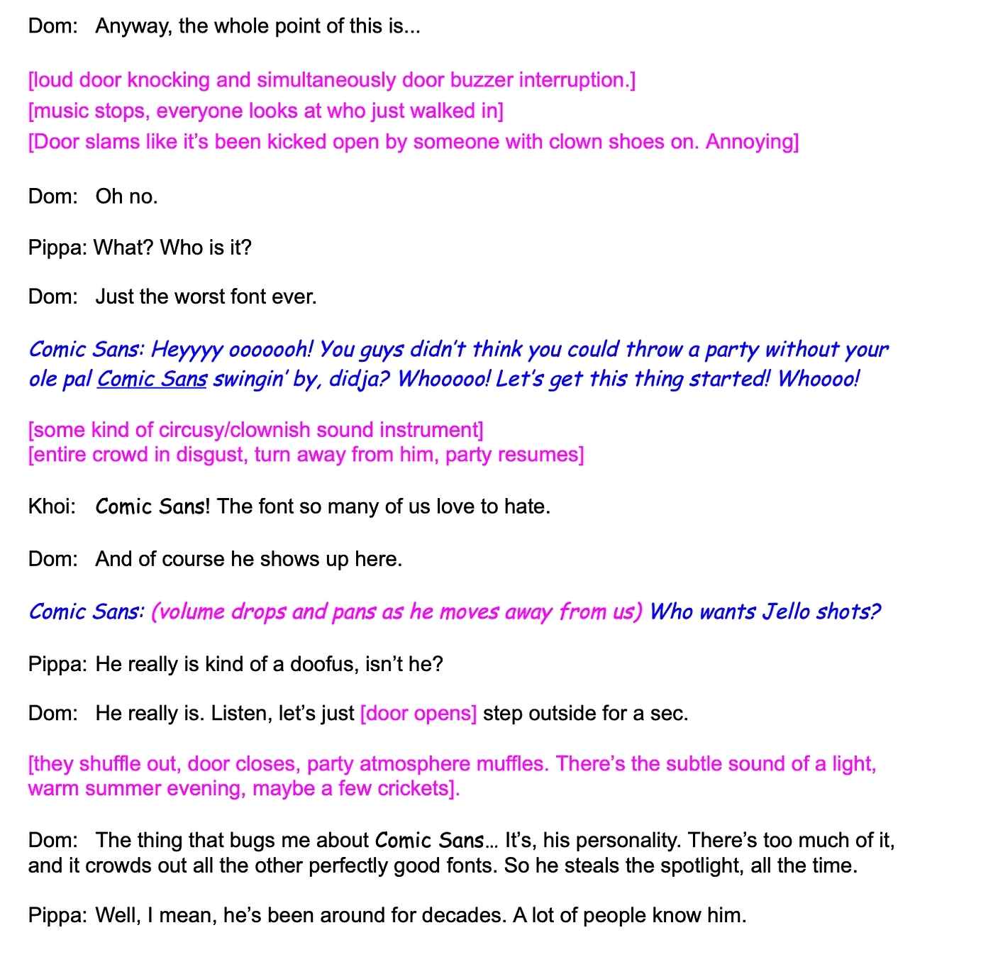
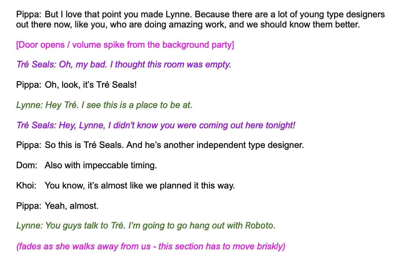
Then, I scripted a very specific scene filled with stage directions. In essence, I wrote an audio drama.

Listen to the script dramatized into audio.
And finally, listen to our prototype (the audio dramatization mixed in with the walla).
Ok. That was a bunch of work. (Thanks to Shawn Cole for the mix!) We loved how ridiculous it sounded. And we agreed this concept did have legs. We also agreed that the prototype was too long. Tightened up, it could be a fun and attention-grabbing way to start an episode.
“Once I heard the prototype, I was all in,” says Khoi Vinh. He’s a senior director of design at Adobe and the host of the Wireframe podcast. “But I wasn’t sure how far we should push the party idea beyond the cold open. It was important that we had an interesting story to tell that went beyond talking about Comic Sans — which, by the way, I don’t much care for either.”
Right. It was a good point. As a creative partner, Adobe’s feedback is always sharp, fair, and collaborative. So we had two choices: either we abandon the concept after the cold open — once we’ve established the story’s central question — or we double down and figure out a way to make the entire episode take place at an imaginary party.
Option two sounded more fun. So we leaned in.
Production
All we had to do now was make all of our episode guests (the real people we interviewed for the episode) sound as if they too were at this imaginary font party. That meant that type expert Stephen Coles, Creative Review deputy editor Emma Tucker, and type designers Lynne Yun (Space Type Continuum) and Tré Seals (Vocal Type) all had to be interviewed in a specific way to make sure the idea held together.
- More than ever, we made sure every guest’s interview cleanly picked up a conversation thread from another guest. So Emma Tucker’s segment motivates Khoi to go find Stephen Cole at the party. And Stephen’s interview sets up story producer Pippa Johnstone to introduce Lynne Yun’s segment, and so on.
- In production, each guest was interviewed individually by Khoi, Pippa, or me. But in the episode, it sounds like our guests are talking to all three of us at the same time. This required a lot of audio drama-style scriptwriting to make it sound like we were hanging out together.
- Not only that, but then each guest had to deliver some scripted lines that could be used to stage them at the house party. Things like asking them to call out other guests by name (“Hey Lynne!” “You guys talk to Tré, I’m going to go hang with Roboto”).
This is edited behind-the-scenes sound of Pippa coaching guest Lynne Yun through some of this work, blended into the final result.

Pippa says this last part “was a challenge because it’s a bit funny and a bit awkward to ask these guests, you know, experts in their field, to play-act this gimmick. But luckily, they were game.”
Once we had all the elements together, it was time to mix.
Sound Design
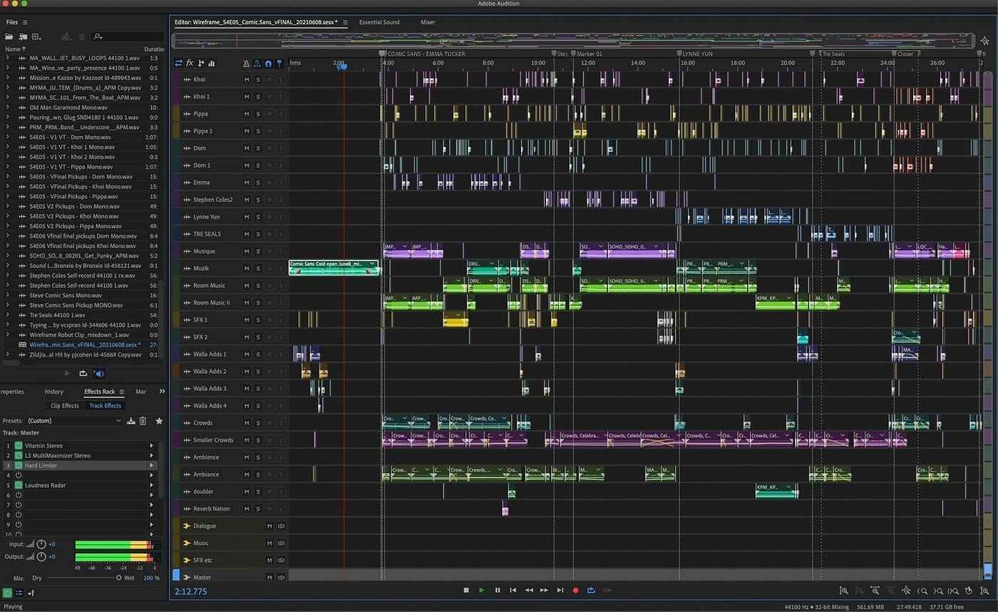
It turns out that when you add three hosts, four guests, half a dozen or so font characters, a bunch of party walla, sound effects, and filters, you end up with a massive session file.
This is what the finished episode looks like in sound designer Christian Prohom’s Adobe Audition assembly.

“It’s not just that there were a lot of elements,” says Christian, “it’s that these elements were all recorded in completely different environments. They all sound different, and it needs to feel like everyone’s at the same party.”
It’s true, every host, guest, and performer was independently recorded in their own homes in Canada, the US, and the UK. We were making this episode in a pandemic, after all. We did our best to record clean audio, but it still took a lot of audio restoration work to make everything sound its best (side note: sound design team, you know I love you right?). In the end, you may hear some differences between the guests. But given our ambition, we’re happy with what we were able to pull off.
The party idea affected the music design too. Usually, we add music to a story to underscore specific narrative moments. But you can’t do that with this episode—all the music has to feel like it’s coming from the party itself.
On top of that, the walla we recorded had to be carefully mixed so it didn’t sound looped (which it is, of course) and didn’t pull focus away from the episode’s actual content. Early mixes made it clear that constant music and party sounds would distract us from the story, and it got a little tiresome too. It was all about fine-tuning and then fine-tuning some more.
Creative bravery for all
We think we ended up with an episode that is sound-rich and original. In other words, all the crazy ideas, bad puns, fancy edits, rounds of feedback, prototyping, scripted transitions… they’re all in service of the story. Which is the point, after all.
Season four of Wireframe wanted to embrace a theme of “creativity for all,” a concept that Adobe champions. This season finale gave us an opportunity to take that motto to heart and push our own creative boundaries. The result is a fun listen that illustrates how a brand and podcasting partner, like Adobe, takes the concept of creative bravery to heart. I hope you’ll agree.
(Though let’s be clear, Comic Sans is still the worst.)
Follow or subscribe to Wireframe with Khoi Vinh.
Sign up for the Pacific Content Newsletter: audio strategy, analysis, and insight in your inbox.
