What makes good podcast cover art?

Ivo Matić is a designer.
He specializes in visual branding and yet, some of his favorite projects start with no visual references at all: podcasts.
“One of the reasons why I became a designer was because I really loved how record labels looked like and the physical medium of CDs. That’s the world I fell in love with a long time ago,” said Ivo, who is in charge of creating podcast art at Frequency Podcast Network.
“I find that podcasts have a little bit of that spirit. There’s still a lot of creative freedom.”
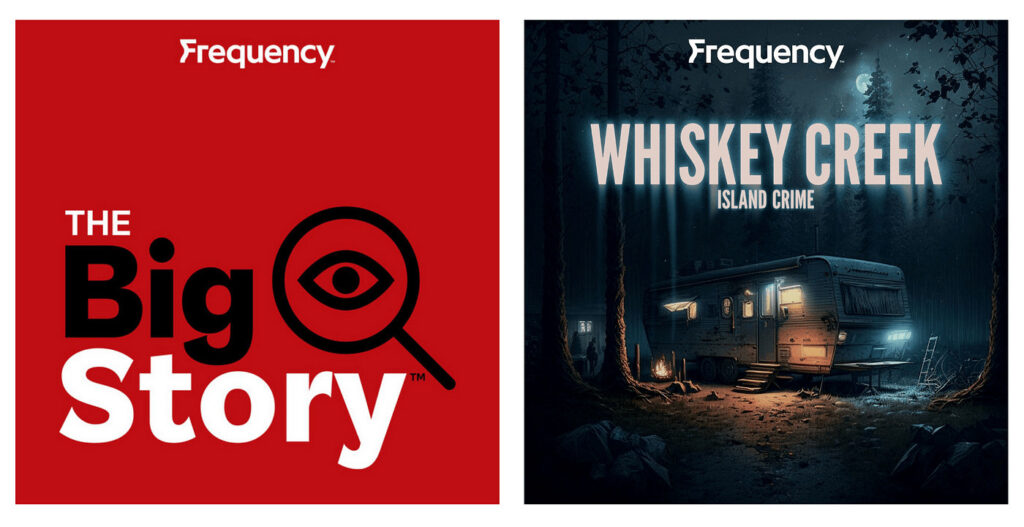
Ivo has designed artwork for dozens of shows at Frequency Podcast Network, including: The Big Story, Island Crime, and Heaven Bent.

Case Study: Heaven Bent
Heaven Bent is an original podcast by Frequency Podcast Network about the mysterious (and sometimes dangerous) world of evangelical Christianity.
When Ivo received the brief to create podcast art for the show, the first thing he did was listen to a few episodes of the podcast. Ivo said he never skips this step. He likened it to creating visual art for music. “How can you design a record cover if you haven’t listened to the music?”
Then, Ivo browsed through the “black and white” and “spooky” images that podcast host Tara Jean Stevens provided. This gave him an idea of what the podcast production team had initially envisioned.
But designers really shine when they add their own take to an idea.
Ivo wanted to help Heaven Bent stand out in the crowded black and white landscape of serialized podcasts about cults.
“Creating key art to me is really about creating something recognizable as an icon because people are scrolling on their phone and so I find having that visual hook is important in podcasts,” he said.
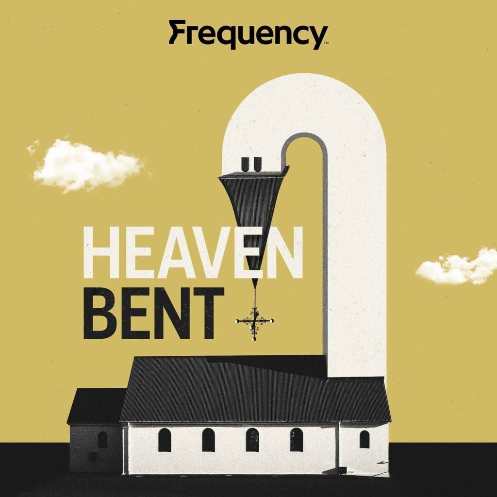
Then, the idea hit him.

“I went with something that’s aesthetically more clean than what is usual for the genre,” said Ivo.
He placed the image among podcast art of other true crime-esque shows.
“It felt right,” he said. “It looked iconic enough and it was different from everything else on the page.”
Ivo then sent this idea and several other more conservative ones to the marketing team. They provided several rounds of feedback before Ivo presented his work to the final decision maker — the podcast team.
“I gave them a couple of options that they wanted to see, but also some that expanded on that and were a bit more unique.”
Ivo watched for the podcast team’s reaction when he showed them the images.
They immediately pointed at the bent bell tower. “They were like, that’s the one.”
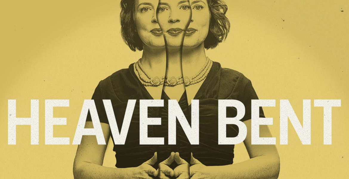
With verdict in hand, Ivo polished up other visual elements that would compliment the square podcast art. Many podcast platforms now ask for other art files such as banner art for promotional purposes.

This “system” of artwork for Heaven Bent, as Ivo puts it, has allowed the show to build a strong presence for itself outside of podcast platforms. Ivo’s work acts as an anchor for all visual references — like social media posts and video trailers — even now, in Season 3.
The show’s visual identity even helps host Tara Jean find stories for future seasons. She uses the memorable artwork on Facebook to catch the attention of people who may have stories they want to share on the podcast.
This was all made possible by the set of iconic images that Ivo created for the show’s initial launch. He says the art for Heaven Bent remains one of his favourites. “It has that wow factor.”
Top Takeaways
- Start early. Creating art is an iterative process and can take anywhere from a few weeks to several months. So start thinking about what message you want your podcast art to convey “as soon as you can,” said Ivo.
- Hire a designer. First impressions matter. If the podcast artwork looks bad, listeners will assume the podcast sounds bad. Even if you have a clear sense of what you want the podcast art to look like, a designer can make your idea shine. “In the end, everybody can see when something is not done by a designer,” said Ivo.
- Take creative risks. You want your podcast to stand out in the sea of shows available. “Especially in terms of colors, go crazy. Use bright colors. I find it looks really good in the digital world,” said Ivo.
- Create a system. Creating visuals that work as a square thumbnail, a rectangle, and a skinny banner will let you showcase your podcast in a variety of places. “You don’t want to repeat whatever is on the key art,” said Ivo. “You’re technically building a little bit of a system to the art. It’s not just, here’s a square and goodbye.”
- Begin with minimalism. If you don’t know where to start, think about the essence of your show and imagine, “if your show was a glyph, what would that glyph be?” said Ivo. “That’s the most minimalistic form of your podcast. Once you have that, you can find that range where you’re going from that to hyper realism.”
Sign up for the newsletter for the latest brand storytelling and podcast inspiration, insights, right in your inbox, every two weeks. We promise to never spam you.
