Inside the podcast ecosystem, square artwork reigns supreme.
In “now playing” screens, in search results, and across dozens of podcast directories and websites, square artwork is everywhere.
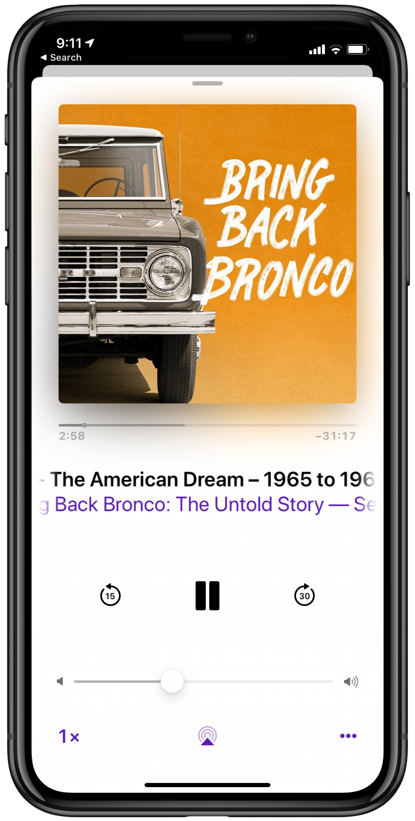


Clearly, square artwork is an important part of your show’s visual identity and product packaging, and a 1:1 image is often what people think of when they think of “podcast art” (AKA “cover art” or a “podcast tile”).
But for many podcasts, square artwork isn’t enough.
Why?
The problem with squares
Often, square podcast artwork isn’t a good fit outside the podcast ecosystem. For example, take social media, where you might want to market your show:
- Twitter’s in-stream images aren’t square. They’re 16:9.
- Facebook timeline photos aren’t square. They’re ~1.9:1.
- LinkedIn link previews aren’t square. They’re 1.91:1.
- Instagram stories aren’t square. They’re tall, and in portrait orientation.
- Open Graph images should be 1.91:1, not square.
When I scroll through my social feeds, I often see square podcast artwork awkwardly auto-cropped into landscape or portrait presentations.
Faces get cropped, text gets clipped, and otherwise thoughtfully-designed square artwork gets mangled. It’s a bad look.
The solution
Think beyond the square. Build versatility into your show’s overall visual identity.
Don’t think of your show’s square artwork as its primary visual asset. Instead, consider all the different places your show will appear (podcast apps, social platforms, email newsletters, websites, etc.), then design your show’s artwork with flexibility in mind.
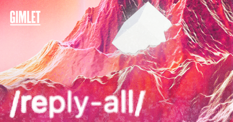
For example, look at the series-level artwork for Reply All. The square artwork appears in podcast apps and directories, while the social-friendly landscape version is referenced in the Reply All website’s og:image meta tags:

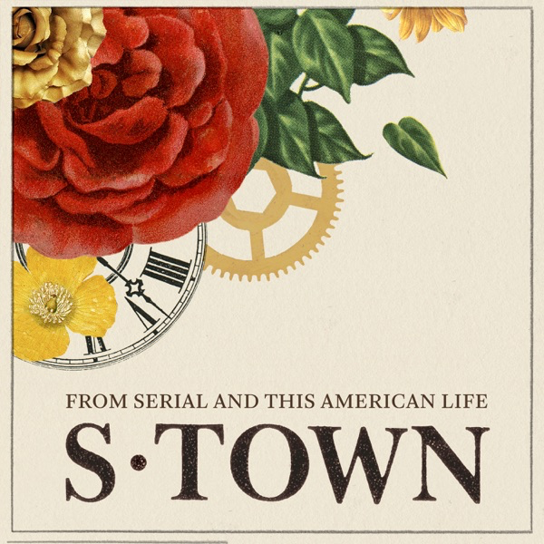
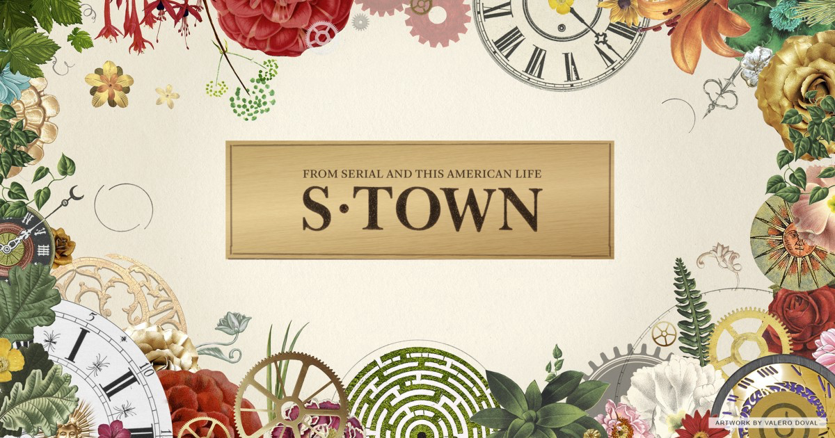
S-Town took a similar approach, producing context-appropriate square and landscape artwork:
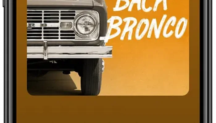
Here at Pacific Content, we recently helped Ford Motor Company launch Bring Back Bronco: The Untold Story. The talented team at GTB created a visual identity for the show that works well in square, landscape, and portrait orientations:
If your design process starts and ends with building a 1:1 square, it’ll be difficult to adapt your podcast artwork to different formats. But if you begin with flexibility in mind, creating additional assets becomes much easier.
Not just for series-level artwork
These same principles apply to episodic artwork, too. If your podcast includes episode-specific artwork, don’t stop at the square.
For example, for the most recent season of Command Line Heroes, Red Hat created beautiful episode-specific artwork, in both square and landscape versions. Here’s the artwork for S5E3, “What Kind of Coder Will You Become?”

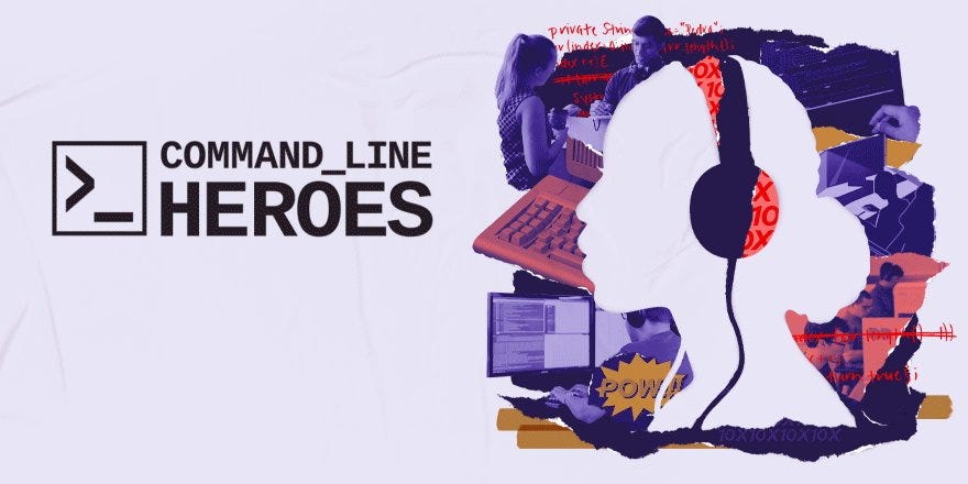
Episode-specific widescreen artwork allows Red Hat to promote this specific episode of Command Line Heroes on Twitter with a lovely context-appropriate animation:
Remember
- Square podcast artwork matters for podcast apps and directories
- Square artwork often gets awkwardly cropped when shared on social platforms
- Build flexibility into your show’s visual identity
- Consider creating multiple assets at both the series-level and episode-level
How does your show’s artwork appear outside square-friendly contexts?
Sign up for the Pacific Content Newsletter: audio strategy, analysis, and insight in your inbox. Once a week.
